matplotlib绘图逻辑(上)
matplotlib是一个基于Python的绘图库,具有对2D的完全支持和对3D图形的有限支持,在Python科学计算社区中广泛使用。
本文对matplotblib的基本绘图逻辑进行了一个详细的梳理。写作过程中参考了很多资料,由于写作是断续的,有些可能忘记引用,在此表达感谢。
有必要提及,Matplotlib的主要开发者John D. Hunter是一名神经生物学家,但2012年不幸因癌症去世,感谢他开发出了一个这么优秀的库。
如果你觉得看完本文不够,下面是一些我认为比较好的文章:
开发团队的随感:http://www.aosabook.org/en/matplotlib.html
公众号《王的机器》推文:https://mp.weixin.qq.com/s/vUaIfjM7R2Ac3ICPBh39UQ
以及最重要的API文档:
下面是本文的索引。
- matplotlib绘图逻辑(上)
- 1.三种绘图模式
- 2.面向对象绘图基础
1.三种绘图模式
在matplotlib的网上教程中,经常可以看到很多种作图模式,绘制出一样的图。
有时候容易凌乱,因此做一个简单的梳理。
根据绘图理念的不同,分成了3种。
不同的绘图模式,本质上是利用了Matplotlib的不同层提供的接口,在下一节会具体介绍。
本文的重点会放在面向对象上。
1.pylab
函数式作图,最接近matlab,但是不推荐。
from pylab import *
2.pyplot交互式
(适合IPython这种交互式编辑器,本质上是利用pyplot脚本层对底层的封装,使得绘图非常简单)
非常简单的交互式作图,直接根据命令作图,但个性化能力有限。
import matplotlib.pyplot as plt
 import numpy as np
 x = np.arange(1,11)
 y = np.random.random(10)

 plt.plot(x,y)
 plt.title('pyplot')
 plt.show()
3.面向对象式
最接近底层的作图模式,贯彻了万物皆对象的理念,可以定制很多高难度的图。
流程可以表述为:
FigureCanvas 实例实例化 Figure实例(添加到画板上)
使用 figure 实例创建一个或多个 Axes 或 Subplot 实例(放置画纸)
使用 Axes实例方法创建 具体构图零件。(画画)
import numpy as np
from matplotlib.backends.backend_agg import
FigureCanvasAgg as FigureCanvas
from matplotlib.figure import Figure

fig = Figure()
canvas = FigureCanvas(fig)

x = np.random.randn(10000)
ax = fig.add_subplot(111)
ax.hist(x, 100)
fig.savefig('matplotlib_histogram.png')
但有时候,我们也会将交互式与面向对象式进行结合,比如:
import matplotlib.pyplot as plt
import numpy as np
x = np.arange(1,11)
y = np.random.random(10)
##创建画布
fig = plt.figure()
##创建一个坐标轴绘图区
ax1 = fig.add_subplot(1,1,1)
##折线图
plt.plot(x,y)
##为ax1添加一些零件
ax1.set_title('object oriented')
对于面向对象式+交互式结合的方法,一个基本的绘图流程可以表述为:
创建一个 figure 实例;使用 figure 实例创建一个或多个 Axes 或 Subplot 实例;使用 Axes实例方法创建具体构图零件。
2.面向对象绘图基础
参考资料:
matplotlib有三层结构。
三层结构可以看作一个栈结构。上一层的layer懂得如何调用下一层layer,但下一层的layer无法调用上层的layer.
栈结构如图:
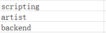
自顶向下依次是scripting artist backend
2.1 matplotlib三层结构
1.backend
参考资料:
https://matplotlib.org/3.1.0/api/backend_bases_api.html
后端层
后端层有三个内置的抽象接口类: FigureCanvas(类似于画板):即matplotlib.backend_bases.FigureCanvas,它定义并包含绘制图形的区域。对于一些UI工具(例如:Qt),FigureCanvas内部有具体的实现,它知道如何把自己(画板)插入到一个UI界面中,也知道如何调用Renderer绘制到Canvas上,同时,一些UI操作事件也可以被自动转化为matplotlib Event。
Renderer(类似于画笔):即matplotlib.backend_bases.Renderer,Renderer类的一个实例用于在图形画布上绘制。它是一个基于像素的核心渲染器,调用了C++的:Anti-Grain Geometry(Agg)。Agg是一个C ++高性能图像模板库,基于像素的核心渲染器。这是一个高性能库,用于渲染消除锯齿的2D图形,从而生成有吸引力的图像。matplotlib提供了将像素缓冲区插入到交互界面的支持,这些像素由agg后端渲染产生。因此可以跨UI和操作系统获得像素精确的图形。
Event(事件,由用户定义):即matplotlib.backend_bases.Event,处理用户输入,如键盘敲击和鼠标点击。Event框架把键盘/鼠标事件映射到了2个类KeyEvent 和 MouseEvent上,用户通过触发事件,框架内部就会调用相关函数。
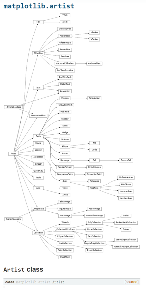
2.artist
artist层包含了一个最主要的对象Artist。Artist对象知道如何获取Renderer实例,并使用它在Canvas实例上进行画画。
我们在Matplotlib图上看到的所有内容都是Artist实例。
包括 title, line ,tick labels,images等等。

matplotlib.artist.Artist是所有Artist类的基类,它包含了所有Artist类共有的属性:将artist对象的坐标系统转化成canvas对象的坐标系统。
artist对象如何与backend发生耦合?
artist对象的类必须实现draw方法,该方法能够从后端传入render实例,由于render实例有一个指向想要绘制的canvas类型(可以是PDF,SVG等)的指针,因此,它会调用合适的方法在上面进行绘制。
##SomeArtist继承了Artist类,实现了draw方法
class SomeArtist(Artist):
    'An example Artist that implements the draw method'

    def draw(self, renderer):
        """Call the appropriate renderer methods to paint self onto canvas"""
        if not self.get_visible():  return

        # create some objects and use renderer to draw self here
        renderer.draw_path(graphics_context, path, transform)
Artist对象有两种类型
第一种类型是原始类型(primitive type):例如Line2D, Rectangle, Circle, Text类 的实例。
第二种类型是复合类型(composite type),例如Figure,Axes,Tick,Axis类的实例。
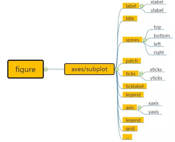
几个重要的点:
1.figure Artist是一个图中所有元素的顶层对象,包含并管理这些元素。
2.composite type中最重要的对象是axes,因为它是matplotlib API几乎所有方法发挥作用的地方,包括创建并操纵刻度线(ticks),轴线(axis lines),grid或background。
3.一个composite type可以包含其他的composite type以及primitive type。比如:一个figure(画布)可以包含多个坐标轴(axes)以及text等元素,它的背景是Rectangle实例。
##一个绘图实例
# Import the FigureCanvas from the backend of your choice
#  and attach the Figure artist to it.
from matplotlib.backends.backend_agg import FigureCanvasAgg as FigureCanvas
from matplotlib.figure import Figure
fig = Figure()
canvas = FigureCanvas(fig)

# Import the numpy library to generate the random numbers.
import numpy as np
x = np.random.randn(10000)

# Now use a figure method to create an Axes artist; the Axes artist is
#  added automatically to the figure container fig.axes.
# Here "111" is from the MATLAB convention: create a grid with 1 row and 1
#  column, and use the first cell in that grid for the location of the new
#  Axes.
ax = fig.add_subplot(111)

# Call the Axes method hist to generate the histogram; hist creates a
#  sequence of Rectangle artists for each histogram bar and adds them
#  to the Axes container.  Here "100" means create 100 bins.
ax.hist(x, 100)

# Decorate the figure with a title and save it.
ax.set_title('Normal distribution with $\mu=0, \sigma=1$')
fig.savefig('matplotlib_histogram.png')
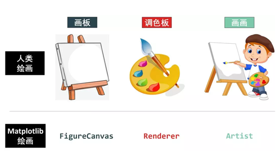
下图模拟了人类绘画与matplotlib绘画的过程:
3.脚本层(script layer)
为非专业程序员的科学家开发,脚本层本质上是Matplotlib.pyplot接口,它将定义画布(canvas)和定义figure artist实例的过程自动化,并连接它们,因此,脚本层本质上是前两层的wrapper。
pyplot接口是围绕核心Artist API的一个相当薄的包装器,它试图通过使用最少量样板代码暴露脚本接口中的API函数。
通过matplotlib提供的状态脚本接口,可快速轻松以MATLAB绘图风格绘制图形。
来看一个通过脚本层绘图的实例。(本质上是前面提到的交互式方式)
##当pyplot模块加载后,会自动解析配置文件,文件包含用户状态与一些偏好等
##比如:可以是一个UI界面后端QtAgg,那么就会在内部载入GUI框架;
##或者是一个普通的后端,如:Agg,那么脚本会产生一个硬拷贝的输出
import matplotlib.pyplot as plt
import numpy as np

x = np.random.randn(10000)

##第一次调用,如果环境中没有figure axes对象,会新建一个。
plt.hist(x, 100)

##内部调用方法Axes.set_title(r'Normal distribution with $\mu=0, \sigma=1$')
plt.title(r'Normal distribution with $\mu=0, \sigma=1$')
plt.savefig('matplotlib_histogram.png')

##执行该函数会对figure对象进行render,如果是在一个GUI环境中,会开启GUI的主循环并显示图片。
plt.show()
而事实上,我们绝大多数用户使用的都是脚本层的接口。仅仅使用一个plt函数(import matplotlib.pyplot as plt),就能够完成绝大多数绘图。
为什么脚本层无需要指定fig就可以实现绘图?
Pyplot 为底层绘图库对象提供了有限状态机接口,从而引入了当前轴(current axes) 的概念。
state-machine 会自动和以用户无感的方式创建 Figures(图)对象 和 axes (轴域),以实现所需的绘图操作。
具体一点: plt.plot() 的第一个调用将自动创建 Figure 和 Axes 对象,以实现所需的绘图。对 plt.plot() 后续的调用会重复使用当前 Axes 对象,并每次添加一行。设置 title 标题、legend 图例等,都会使用当前 Axes 对象,设置相应的 Artist。
利用一个简版的例子来看一下脚本层是如何对artist和canvas进行包装的。
##@autogen_docstring(Axes.plot)装饰器从相应的API方法中提取文档字符串,并将正确格式化的版本附加到pyplot.plot方法;
##ax.gca()调用有限状态机来获取当前的Axes,如果没有就创建一个。

##对ret = ax.plot(* args,** kwargs)的调用将函数调用及其参数转发给适当的Axes方法,并存储稍后要返回的返回值。

@autogen_docstring(Axes.plot)
def plot(*args, **kwargs):
    ax = gca()

    ret = ax.plot(*args, **kwargs)
    draw_if_interactive()

    return ret
2.2 Artist:辅助显示层
Canvas是位于最底层的系统层,在绘图的过程中充当画板的角色,即放置画布的工具。
通常情况下,我们并不需要对Canvas特别的声明,但是当我需要在其他模块如PyQt中调用Matplotlib模块绘图时,就需要首先声明Canvas,这就相当于我们在自家画室画画不用强调要用画板,出去写生时要特意带一块画板。
Figure是Canvas上方的第一层,也是需要用户来操作的应用层的第一层,在绘图的过程中充当画布的角色。 当我们对Figure大小、背景色彩等进行设置的时候,就相当于是选择画布大小、材质的过程。因此,每当我们绘图的时候,写的第一行就是创建Figure的代码。
Axes是应用层的第二层,在绘图的过程中相当于画布上的绘图区的角色。 一个Figure对象可以包含多个Axes对象,每个Axes都是一个独立的坐标系,绘图过程中的所有图像都是基于坐标系绘制的。
总结:对于普通用户,只需要记住:Figure是画布,axes是绘画区,axes可以控制每一个绘图区的属性。
1.figure:画布
本节会做一个基本介绍。
创建figure
创建一个画布,可以指定很多参数
import matplotlib.pyplot as plt

fig = plt.figure(
num = None,               # 设定figure名称。系统默认按数字升序命名的figure_num(透视表输出窗口)e.g. “figure1”。可自行设定figure名称,名称或是INT,或是str类型;
figsize=None,             # 设定figure尺寸。系统默认命令是rcParams["figure.fig.size"] = [6.4, 4.8],即figure长宽为6.4 * 4.8;
dpi=None,                 # 设定figure像素密度。系统默命令是rcParams["sigure.dpi"] = 100;
facecolor=None,           # 设定figure背景色。系统默认命令是rcParams["figure.facecolor"] = 'w',即白色white;
edgecolor=None, frameon=True,    # 设定要不要绘制轮廓&轮廓颜色。系统默认绘制轮廓,轮廓染色rcParams["figure.edgecolor"]='w',即白色white;
FigureClass=<class 'matplotlib.figure.Figure'>,   # 设定使不使用一个figure模板。系统默认不使用;
clear=False,                     # 设定当同名figure存在时,是否替换它。系统默认False,即不替换。

**kwargs)
e.g.
fig = plt.figure(num=1,figsize = [10,10],dpi=400,
                 facecolor = 'grey',
                edgecolor = 'blue')
这样,我们创建出来的画布就是灰色的了
创建多个画布
当然,顺着面向对象的概念,也可以创建多个画布,即:创建多个画布对象即可。
fig1 = plt.figure()
ax11 = fig1.add_subplot(1,1,1)
ax11.plot([1,2],[1,2])

fig2 = plt.figure()
ax21 = fig2.add_subplot(1,1,1)
ax21.plot([1,2],[1,2])
figure的属性
参考
https://matplotlib.org/api/asgen/matplotlib.figure.Figure.html
figure来自matplotlib.figure.Figure类,Figure继承了Artist类,是所有绘图元素的顶层容器。
通过pyplot脚本层进行包装,我们可以直接通过plt.figure()调用该类。
Figure的属性包含了 Patch,在笛卡尔坐标中,patch 是 Rectangle,在极坐标中是 Circle。这个 patch 确定了绘图区的 shape,background 和 border。
笛卡尔坐标系统的fig(默认)通过属性Rectangle实例对其background patch进行填充,见下面的实现:
self.patch = Rectangle(
            xy=(0, 0), width=1, height=1,
            facecolor=facecolor, edgecolor=edgecolor, linewidth=linewidth,
            visible=frameon)

fig一些常见的属性与方法
import matplotlib.pyplot as plt
fig = plt.figure()

##打印fig size
print(fig)

fig.suptitle('this is a test')
获取figure包含的对象
figure.patch

##返回一个可迭代对象
figure.axes

例子:
for ax in fig.axes:
    ax.axis('off')

for ax in fig.axes:
    ax.grid(True)
例子1:
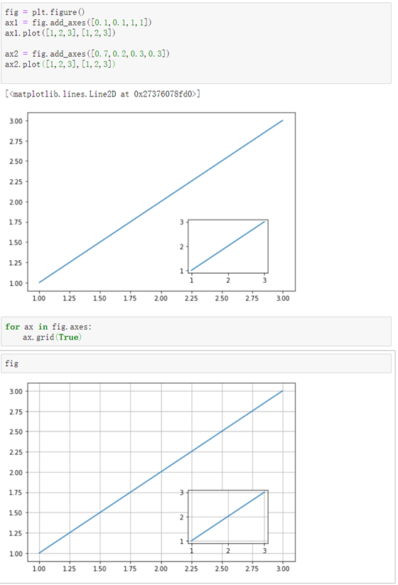
例子2:
##本质上,只需要掌握对应的Patch有哪些方法就能够对patch进行修改
for ax in fig.axes:
    rect = ax.patch
    rect.set_facecolor('g')
    rect.set_alpha(0.1)
效果:
下表是 figure 包含的一些Artist
.png)
figure的getter/setter
仅仅举几个例子,后面会经常看到
setter:
fig.set_edgecolor()
fig.set_facecolor()


getter:
##返回一个axes列表,可以对坐标轴进行控制
fig.get_axes()
2.axes:坐标系绘图区
介绍
matplotlib.axes.Axes 是 matplotlib 的核心。它包含了 figure 中使用的 大部分Artist ,而且包含了许多创建和添加 Artist 的方法。
当然这些函数也可以获取和自定义 Artists。 axes拥有很多属性。
这些属性本质上是一个对象,都属于artist基类。
关系如下:
一个简单的例子:
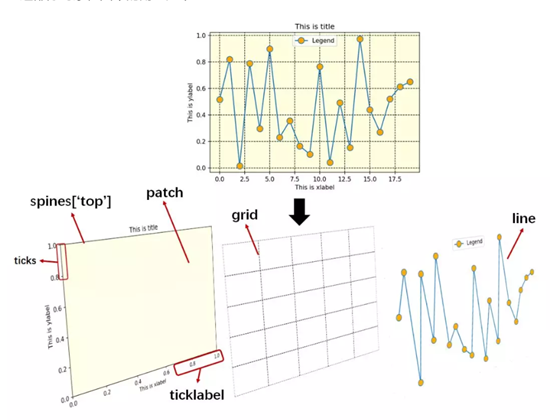
• spines: 指的是axes边框部分,分为上下左右。
• patch:指的是spin围成的2D区域
• line:设置线条(颜色、线型、宽度等)和标记
• ticks:指的是刻度线
axes与subplot的区别
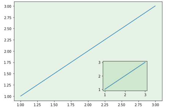
我们常常在一些教程中看到一幅图内嵌套了多个图,或者一个图内分成了好多子图。
一幅图 (Figure) 中可以有多个坐标系 绘图区(Axes), 一幅图中可以有多幅子图绘图区 (Subplot), 那么坐标系和子图是不是同样的概念?
在绝大多数情况下是的,两者有一点细微差别:
坐标系在母图中的网格结构可以是不规则的,子图subplot是坐标系axes的一个特例,子图在母图中的网格结构必须是规则的,而坐标系在母图中的网格结构可以是不规则的。 由此可见,子图是坐标系的一个特例。
(subplot就是自动整齐的排列好子图了,axes就是自己手动排,就更灵活和麻烦。)
创建axes
关于axes 子图的排版,详细的参考:
https://matplotlib.org/tutorials/intermediate/gridspec.html#sphx-glr-tutorials-intermediate-gridspec-py
axes的创建方式 坐标系绘图法比子图更通用,更灵活,当然也更难。 常见的有3种生成方式 • 用 gridspec 包加上 subplot()
• fig.add_axes()
• 用 plt.axes()
plt.axes([l,b,w,h])
其中 [l, b, w, h] 可以定义坐标系:
l 代表坐标系左边到 Figure 左边的水平距离
b 代表坐标系底边到 Figure 底边的垂直距离
w 代表坐标系的宽度
h 代表坐标系的高度
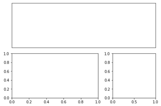
1.用 gridspec 包加上 subplot()
import matplotlib
import matplotlib.pyplot as plt
import matplotlib.gridspec as gridspec

fig2 = plt.figure(constrained_layout=True)
spec2 = gridspec.GridSpec(ncols=2, nrows=2, figure=fig2)
f2_ax1 = fig2.add_subplot(spec2[0, 0])
f2_ax2 = fig2.add_subplot(spec2[0, 1])
f2_ax3 = fig2.add_subplot(spec2[1, 0])
f2_ax4 = fig2.add_subplot(spec2[1, 1])

利用切片形式进行更加个性化的定制:
import matplotlib
import matplotlib.pyplot as plt
import matplotlib.gridspec as gridspec

fig3 = plt.figure(constrained_layout=True)
G = gridspec.GridSpec(ncols=3, nrows=2, figure=fig3)
ax1 = fig3.add_subplot(G[0,:])
ax2 = fig3.add_subplot(G[1,:2])
ax3 = fig3.add_subplot(G[1,2])

##隐去x轴tick label
ax1.set_xticklabels('')
##隐去x轴tick line
for i in ax1.xaxis.get_ticklines():
    i.set_markersize(0)
    i.set_markeredgewidth(0)

ax1.set_yticklabels('')
for i in ax1.yaxis.get_ticklines():
    i.set_markersize(0)
    i.set_markeredgewidth(0)
绘制一个重叠图:
###坐标系1
plt.axes([0,0,1,1],facecolor = 'g')
plt.xticks([])
plt.yticks([])

###坐标系2
plt.axes([0.2,0.2,1,1],facecolor = 'r')
plt.xticks([])
plt.yticks([])
###坐标系3
plt.axes([0.4,0.4,1,1],facecolor = 'b')
plt.xticks([])
plt.yticks([])

2.fig.add_axes()
fig = plt.figure()
ax1 = fig. add_axes()
ax1.plot([1,2,3],[1,2,3])

ax2 = fig.add_axes([0.7,0.1,0.3,0.3])
ax2.plot([1,2,3],[1,2,3])
3.plt.axes() ##脚本层的封装
###坐标系1
plt.axes([0.1,0.1,1,1])
plt.plot([1,2,3],[1,2,3])
###坐标系2
plt.axes([[0.7,0.1,0.3,0.3])
plt.plot([1,2,3],[1,2,3])
两者效果是一样的:
axes能不能做到和subplot效果相似?可以 只需要按照对应位置调整好坐标即可
###坐标系1
plt.axes([0.1,0.1,1,1])
plt.plot([1,2,3],[1,2,3])
###坐标系2
plt.axes([0.1,1.2,1,1])
plt.plot([1,2,3],[1,2,3])
axes的getter与setter
setter与getter是设计逻辑,几乎所有的类对象都有setter与getter方法。通过getter与setter,能够获取/改变该实例的属性。
通过setter getter可以获取很多artist子类的属性。
matplotlib文档:https://matplotlib.org/api/axes_api.html#the-axes-class 有非常详细的介绍。 一些常见的属性如下:
ax.set_*
ax.get_*

*包括:
alpha
title

tick
xticks
yticks

label
xlabel
ylabel


xlim
ylim


##axis只有getter,没有setter
ax.get_xaxis()
ax.get_yaxis()

#标签+刻度构成了axis
##x,y轴的标签
ylabel
xlabel

##x,y轴刻度
xticklabels
yticklabels


get_legend_handles_label

...


也可以通过:
fig.axes[0].title()找到这些对象

##下面是一些例子:
ax.get_ylim()
ax1.set_ylim(0,5)

##ax对象中包含了yaxis实例,该函数获取yaxis对象并调用set_label_text方法完成label添加
ax.set_ylabel('y_label',rotation =45)  ##旋转45度

#一个batch setter
axes.set()

e.g
ax2.set(xlim=[0,2], zorder=2)
获取axes包含的对象
谨记:获取对象的目的是为了调用属于对象实例的方法。
比如: 通过ax.patch获取了ax的patch,接下来通过调用patch的set_color函数进行设定颜色。
ax1.patch.set_color('g')
ax1.patch.set_alpha(0.1)
常见应用
ax.plot():折线图
##当调用 ax.plot 时,会创建 Line2D 实例,并将实例添加到 Axes.lines 列表。
ax.plot([1,100],[1,100])
ax.plot([3,2],[3,2])
ax.lines

##lines列表记录了plot生产的Line2D对象
[<matplotlib.lines.Line2D at 0x13a3d2f4f60>,
 <matplotlib.lines.Line2D at 0x13a3b01c198>]
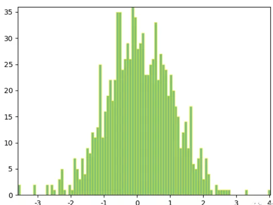
ax.hist():频率分布图
ax.hist()会返回3个对象:
n:频率
bins:箱子的横坐标
patches:每一个箱子patch构成的列表,可以通过patches的索引追踪到每一个patch,并进行人为操作
n, bins, patches = ax.hist(np.random.randn(1000), 50,
    facecolor='yellow', edgecolor='yellow')
要注意,对patch进行操作也有一系列setter和getter,参考patch一节。
3.subplot:子图绘图区
子图subplot是坐标系axes的一个子类,即:一个特例。 子图在母图中的网格结构必须是规则的,而坐标系在母图中的网格结构可以是不规则的。
创建subplot有2种方式(仍旧是第一节提到的三种作图模式种的后两种):交互式和面向对象式。 其中交互式和面向对象式又分别有两种语法。
1.交互式(可以感觉到在绘制复杂图形时,控制能力有限)
import matplotlib.pyplot as plt
import numpy as np
x = np.arange(1,11)
y = np.random.random(10)
##绘制第一个子图
plt.subplot(121)
plt.plot(x,y)
##绘制第2个子图
plt.subplot(122)
plt.plot(x,y)

plt.show()
##另一种语法:
import matplotlib.pyplot as plt
import numpy as np

x = np.arange(1,11)
y = np.random.random(10)

ax1 = plt.subplot(1,2,1)
ax2 = plt.subplot(1,2,2)

ax1.plot(x,y)
ax2.plot(x,y)
2.面向对象式(1):
利用add_subplot
x = np.arange(1,11)
y = np.random.random(10)

fig = plt.figure()
ax1 = fig.add_subplot(1,2,1)  # 共1行2列,第一幅图
ax2 = fig.add_subplot(1,2,2)  # 共1行2列,第二幅图

ax1.plot(x,y)
ax2.plot(x,y)
上面语句的等价于:
x = np.arange(1,11)
y = np.random.random(10)

fig, axes = plt.subplots(1,2) #1行2列
##取第1个子图
axes[0].plot(x,y)
##取第2个子图
axes[1].plot(x,y)
• 创建子图的形式总结:
1.(不推荐)交互式:直接用plt.subplot按顺序操纵
2.面向对象: ax1 = fig.add_subplot() ##最容易理解 plt.subplots() axes[0],axes[1] ##也不错
4.primitive type
Line2D
https://matplotlib.org/api/_as_gen/matplotlib.lines.Line2D.html
Patch:形状
参考:https://matplotlib.org/api/_as_gen/matplotlib.patches.Patch.html#matplotlib.patches.Patch
patch类继承了artist,一个patch是一个2d的artist实例,包含了填充颜色+边框颜色。如果没有对其进行设置,会根据rc params的默认参数进行设置。
这点可以从Patch类的实现中看出:
def __init__(self,
                 edgecolor=None,
                 facecolor=None,
                 color=None,
                 linewidth=None,
                 linestyle=None,
                 antialiased=None,
                 hatch=None,
                 fill=True,
                 capstyle=None,
                 joinstyle=None,
                 **kwargs):
        """
        The following kwarg properties are supported

        %(Patch)s
        """
        artist.Artist.__init__(self)

        if linewidth is None:
            linewidth = mpl.rcParams['patch.linewidth']
        if linestyle is None:
            linestyle = "solid"
         ...
patch对象由matplotlib.patches.Patch生成。 使用时,我们可以通过如下代码进行调用:
import matplotlib.patches as mpatches
import matplotlib.pyplot as plt

red_patch = mpatches.Patch(color='red', label='The red data')
plt.legend(handles=[red_patch])

plt.show()
• 创建常见的patch子类
很多常见的形状继承了patch类,包括:Rectangle、Circle、Polygon等,(matplotlib.patches.Rectangle类等) 创建一个具体的形状本质上是在调用它的构造函数,构造函数有许多的参数可选,需要查阅具体文档。 使用时,我们可以通过如下代码进行调用:
import matplotlib.patches as mpatches
# 创建一个3x3的网格
grid = np.mgrid[0.2:0.8:3j, 0.2:0.8:3j].reshape(2, -1).T
# 添加一个Rectangle
rect = mpatches.Rectangle(grid[1] - [0.025, 0.05], 0.05, 0.1, ec="none")
# 添加一多边形,这里添加一个五边形
polygon = mpatches.RegularPolygon(grid[3], 5, 0.1)
# 添加一个箭头
arrow = mpatches.Arrow(grid[5, 0] - 0.05, grid[5, 1] - 0.05, 0.1, 0.1,
width=0.1)
# 此外,脚本层对常见的形状进行了包装,可以通过plt.xxx()进行调用。
import matplotlib.pyplot as plt
fig = plt.figure()
ax = fig.add_subplot(111)
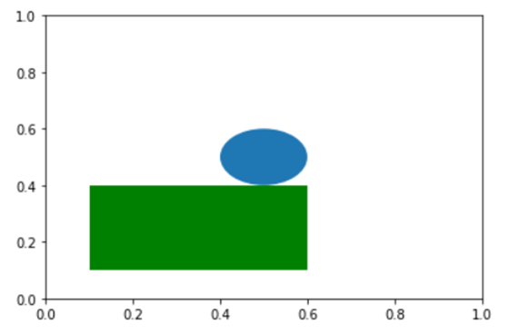
rect = plt.Rectangle([0.1,0.1],0.5,0.3,facecolor= 'g')
cir = plt.Circle([0.5,0.5],0.1)
ax.add_patch(rect)
ax.add_patch(cir)
plt.show()
效果:
• 将Patch添加到axes中
##创建一个图形对象后,还要添加进Axes对象里,使用add_patch()方法
ax.add_patch()

##除此之外,还可以将每一个形状先添加到一个集合里面,然后再将容纳了多个patch对象的集合添加进ax对象里面,
##等价如下:
patches=[]      #创建容纳对象的集合
patches.append(e1)   #将创建的形状全部放进去
patches.append(e2)
collection=PatchCollection(patches)  #构造一个Patch的集合
ax.add_collection(collection)    #将集合添加进axes对象里面去
• 通过setter/getter更改/查询patch的属性。 rectangle、circle等patch子类中内置了大量getter/setter,可以方便获取/改变对应属性。看一个例子:
import matplotlib.pyplot as plt

fig = plt.figure()
ax = fig.add_subplot(111)

rect = plt.Rectangle([0.1,0.1],0.5,0.3,facecolor= 'g')
cir = plt.Circle([0.5,0.5],0.1)
ax.add_patch(rect)
ax.add_patch(cir)
plt.axis('off')
plt.show()


##获取属性
rect.get_fill()
rect.get_path()
##更改属性
rect.set_x(0.5)
rect.set_y(0.5)
图像中的矩形发生了位移:

最后,要强调一点,所有封装好的形状本质上都是通过Path来进行实现的,换句话说,通过path类,我们能够创建一些更复杂的自定义形状。
Path:自定义形状
参考: https://matplotlib.org/api/path_api.html
所有封装好的形状本质上都是通过Path来进行实现的,换句话说,通过path类,我们能够创建一些更复杂的自定义形状。 要想通过path类绘制patch, 首先,需要定义好顶点(vertice)的位置以及对应的code(表明vertex的类)。 code类型包括:
1.STOP
2.MOVETO:移动到当前顶点
3.LINETO:画一条线到当前顶点
4.CURVE3:绘制2次贝塞尔曲线到当前顶点
5.CURVE4:绘制3次贝塞尔曲线到当前顶点
6.CLOSEPOLY:Draw a line segment to the start point of the current polyline.(封闭点)
通过一个例子来看看path类如何产生变量:
import matplotlib.pyplot as plt
from matplotlib.path import Path
import matplotlib.patches as patches


verts = [
    (0., 0.), # 矩形左下角的坐标(left,bottom)
    (0., 1.), # 矩形左上角的坐标(left,top)
    (1., 1.), # 矩形右上角的坐标(right,top)
    (1., 0.), # 矩形右下角的坐标(right, bottom)
    (0., 0.)# 封闭到起点
]

codes = [Path.MOVETO,Path.LINETO,Path.LINETO,Path.LINETO,Path.CLOSEPOLY]

path = Path(verts,codes) #创建一个路径path对象

#依然是三步走
#第一步:创建画图对象以及创建子图对象
fig = plt.figure()
ax = fig.add_subplot(111)

#第二步:将path对象封装成一个PathPatch的实例,PathPatch是Patch的子类
patch = patches.PathPatch(path, facecolor='orange', lw=2)

#第三步:将创建的patch添加到axes对象中
ax.add_patch(patch)


#显示
ax.set_xlim(-2,2)
ax.set_ylim(-2,2)
plt.show()
事实上,python中的histogram barplot等基础的图像也是通过path实现的,比如一个例子:
import numpy as np
import matplotlib.pyplot as plt
import matplotlib.patches as patches
import matplotlib.path as path

fig = plt.figure()
ax = fig.add_subplot(111)

# 固定随机数种子
np.random.seed(19680801)

# 产生1000组随机数,并进行组织
data = np.random.randn(1000)
# n:频率 bins:100个箱的横坐标
n, bins = np.histogram(data, 100)
print(data.shape,n.shape,bins.shape,sep='   ')

# 得到每一个条形图的四个角落的位置
left = np.array(bins[:-1])
right = np.array(bins[1:])
bottom = np.zeros(len(left))
top = bottom + n
nrects = len(left)

nverts = nrects*(1+3+1)
verts = np.zeros((nverts, 2))
codes = np.ones(nverts, int) * path.Path.LINETO
codes[0::5] = path.Path.MOVETO
codes[4::5] = path.Path.CLOSEPOLY
verts[0::5,0] = left
verts[0::5,1] = bottom
verts[1::5,0] = left
verts[1::5,1] = top
verts[2::5,0] = right
verts[2::5,1] = top
verts[3::5,0] = right
verts[3::5,1] = bottom


#第二步:构造patches对象
barpath = path.Path(verts, codes)
patch = patches.PathPatch(barpath, facecolor='green', edgecolor='yellow', alpha=0.5)

#添加patch到axes对象
ax.add_patch(patch)

ax.set_xlim(left[0], right[-1])
ax.set_ylim(bottom.min(), top.max())

plt.show()
可以得到:
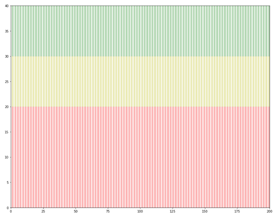
5.练习:通过path定义一个fastqc背景图
import matplotlib.pyplot as plt
from matplotlib.path import Path
import matplotlib.patches as patches

class QualityBoxplot(object):
    def __init__(self,seq_len = 200):


        ##set axes
        self.__seq_len = seq_len
        self.__fig = plt.figure()
        self.__ax = self.__fig.add_subplot(111)
        self.__ax.set_ylim(0,40)
        self.__ax.set_xlim(0,self.__seq_len)
        ##size
        self.__fig.set_size_inches([15,12])
        ##set path
        self.__low_quality_path()
        self.__mid_quality_path()
        self.__high_quality_path()


    def __low_quality_path(self):
        for i in range(self.__seq_len):
            verts = [
                (i, 0), # 矩形左下角的坐标(left,bottom)
                (i, 20), # 矩形左上角的坐标(left,top)
                (i+1, 20), # 矩形右上角的坐标(right,top)
                (i+1, 0.), # 矩形右下角的坐标(right, bottom)
                (i, 0.)# 封闭到起点
            ]
            codes = [Path.MOVETO,Path.LINETO,Path.LINETO,Path.LINETO,Path.CLOSEPOLY]
            path = Path(verts,codes) #创建一个路径path对象
            #第二步:创建一个patch,路径依然也是通过patch实现的,只不过叫做pathpatchbs
            if (i % 2) == 0:
                patch = patches.PathPatch(path, facecolor='r', lw=0.1,alpha = 0.1)
            else:
                patch = patches.PathPatch(path, facecolor='r', lw=0.1,alpha = 0.3)

            #第三步:将创建的patch添加到axes对象中
            self.__ax.add_patch(patch)

    def __mid_quality_path(self):
        for i in range(self.__seq_len):
            verts = [
                (i, 20),
                (i, 30),
                (i+1, 30),
                (i+1, 20.),
                (i, 20)
            ]
            codes = [Path.MOVETO,Path.LINETO,Path.LINETO,Path.LINETO,Path.CLOSEPOLY]
            path = Path(verts,codes)

            if (i % 2) == 0:
                patch = patches.PathPatch(path, facecolor='y', lw=0.1,alpha = 0.1)
            else:
                patch = patches.PathPatch(path, facecolor='y', lw=0.1,alpha = 0.3)

            self.__ax.add_patch(patch)

    def __high_quality_path(self):
        for i in range(self.__seq_len):
            verts = [
                (i, 30),
                (i, 40),
                (i+1, 40),
                (i+1, 30.),
                (i, 30)
            ]
            codes = [Path.MOVETO,Path.LINETO,Path.LINETO,Path.LINETO,Path.CLOSEPOLY]
            path = Path(verts,codes)

            if (i % 2) == 0:
                patch = patches.PathPatch(path, facecolor='g', lw=0.1,alpha = 0.1)
            else:
                patch = patches.PathPatch(path, facecolor='g', lw=0.1,alpha = 0.3)

            self.__ax.add_patch(patch)

if __name__ == '__main__':
    qc =  QualityBoxplot()
效果:
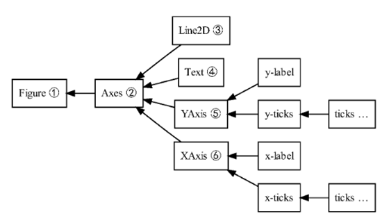
6.composite type
figure 已在前面有了介绍。
axes 已在前面有了介绍。
axis
下图中可以看到Axis(轴)由标签(label)+刻度tick构成。
举个例子
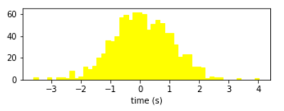
##对于上图来说,标签就是'times(s)',刻度是[-3,-2,-1,...]
ax.get_xticks()
##
array([-4., -3., -2., -1., 0., 1., 2., 3., 4., 5.])
##当然也可以:
axis = ax.xaxis
axis.get_ticklocs()
array([-4., -3., -2., -1., 0., 1., 2., 3., 4., 5.])
ax.get_xlabel()
##
'time (s)'
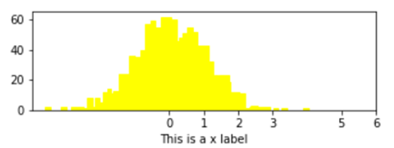
##获取刻度上的标签
ax.get_xticklabels()
for i in ax1.get_xticklabels():
print(i)
##通过setter进行改变:
ax.set_xticks([0,1,2,3,5,6])
ax.set_xlabel('This is a x label')
效果:
以上讲的几乎都是ax的方法,下面看一些属于axis的方法和属性
axis = ax.xaxis

xis.get_ticklocs()
array([ 0.,  1.,  2.,  3.,  4.,  5.,  6.,  7.,  8.,  9.])

axis.get_ticklabels()
<a list of 10 Text major ticklabel objects>

# 默认每个axis都会显示tick,但是仅在 xaxis 底部和 yaxis左侧有tick labels
# 所以你会发现,明明坐标轴上只有10个刻度线,但是通过get_ticklines()方法却能得到20个line2D对象。
#这说明,另外10个(y轴右侧,x轴上方)对象被隐藏起来了
axis.get_ticklines()
<a list of 20 Line2D ticklines objects>

# 默认返回 major ticks
axis.get_ticklines()
<a list of 20 Line2D ticklines objects>

# 要求获取minor ticks
axis.get_ticklines(minor=True)
<a list of 0 Line2D ticklines objects>
下面是 axis 的一些非常有用的获取方法,都由相对应的设置方法:
一些例子
## 旋转刻度
## 本质上是获得了刻度上的Text对象,然后调用其set_rotation方法

for i in ax1.xaxis.get_ticklabels():
    print(i)
    i.set_rotation(45)
##把刻度变粗
##本质上是获得了刻度上的line2d对象,然后调用其set_*方法
for i in ax1.xaxis.get_ticklines():
    print(i)
    i.set_markersize(10)
    i.set_markeredgewidth(3)
## 删除其中某些刻度
##本质上是获得了刻度上的line2d对象,然后调用其set_*方法
## 取巧的地方在于把宽度和长度都设为0

j = 0
for i in ax1.xaxis.get_ticklines():
    j+=1
    if (j % 3) ==0:
        print(i)
        i.set_markersize(0)
        i.set_markeredgewidth(0)
如果想要针对性的删除某几个刻度,可以直接根据索引取到相应的位置,把宽度和长度设为0即可。
##删除第3个刻度
ax1.xaxis.get_ticklines()[6].set_markersize(0)
ax1.xaxis.get_ticklines()[6].set_markeredgewidth(0)
tick
tick也是一个组成类型,它由具体的tick label与grid line构成,这些都可以直接作为 Tick 的属性而被获取。还有一些布尔值变量用来控制是否设置 x 轴上方 ticks 和 labels,y 轴右侧 ticks 和 labels。
通过一副图来看一下什么是tick label,什么是grid line
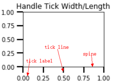
.png)
在前面axis一节,我们会发现ticklabel的对象个数是显示出来个数的2倍,另一半被隐藏起来了,这一节我们试图显示另一半。
for i in ax1.xaxis.get_major_ticks():
    i.label1On = True
    i.label2On = True
locator:决定tick location
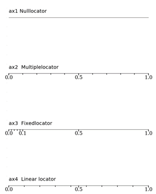
class matplotlib.ticker.Locator是一个单独的类,用于决定tick的在spine上的排布特点。 在实际使用的时候,并不需要过多关注locator这个类的具体内容,只需要清楚它可以作为ax.xaxis.set_major_locator()的一个参数传递即可。 有很多种locator类型,不同的 locator() 可以生成不同的刻度对象,我们来研究以下 8 种:
NullLocator(): 空刻度
MultipleLocator(a): 刻度间隔 = 标量 a
FixedLocator(a): 刻度位置由数组 a 决定
LinearLocator(a): 刻度数目 = a, a 是标量
IndexLocator(b, o): 刻度间隔 = 标量 b,偏移量 = 标量 o
AutoLocator(): 根据默认设置决定
MaxNLocator(a): 最大刻度数目 = 标量 a
LogLocator(b, n): 基数 = 标量 b,刻度数目 = 标量 n
下面是一些例子
import numpy as np
import matplotlib.pyplot as plt

##
fig = plt.figure(figsize = (10,24))
fig.tight_layout()
def init(ax):
    ax.spines['top'].set_color(None)
    ax.spines['right'].set_color(None)
    ax.spines['left'].set_color(None)
    for i in ax.yaxis.get_ticklabels():
        i.set_fontsize(0)
    for i in ax.yaxis.get_ticklines():
        i.set_markersize(0)
        i.set_markeredgewidth(0)

    ##tick line size
    for i in ax.xaxis.get_ticklines():
        #i.set_linewidth(3)
        i.set_markersize(8)
        i.set_markeredgewidth(2)
        #i.set_color('orange')

    ##tick label size
    for i in ax.xaxis.get_ticklabels():
        i.set_fontsize(20)
        i.set_fontfamily('serif')


## null locator --------------------------------------------------
ax1 = fig.add_subplot(611)
init(ax1)
ax1.xaxis.set_major_locator(ticker.NullLocator())
ax1.text(0,0.1,'ax1 Nulllocator',fontsize = 20)


## multiple locator --------------------------------------------------
ax2 = fig.add_subplot(612)
init(ax2)
##按0.5为间隔划分
ax2.xaxis.set_major_locator(ticker.MultipleLocator(0.5))
##按0.1为间隔划分
ax2.xaxis.set_minor_locator(ticker.MultipleLocator(0.1))
##tick line size
for i in ax2.xaxis.get_minorticklines():
    i.set_markersize(5)
    i.set_markeredgewidth(2)
ax2.text(0,0.1,'ax2  Multiplelocator',fontsize = 20)

## Fixed locator --------------------------------------------------
ax3 = fig.add_subplot(613)
init(ax3)
ax3.xaxis.set_major_locator(ticker.FixedLocator([0,0.1,0.5,1]))
ax3.xaxis.set_minor_locator(ticker.FixedLocator([0.02,0.04,0.06,0.08]))
##tick line size
for i in ax3.xaxis.get_minorticklines():
    i.set_markersize(5)
    i.set_markeredgewidth(2)
ax3.text(0,0.1,'ax3  Fixedlocator',fontsize = 20)


## 自定义x轴tick label


## Linear locator --------------------------------------------------

ax4 = fig.add_subplot(614)
init(ax4)
##3为刻度个数
ax4.xaxis.set_major_locator(ticker.LinearLocator(3))
##10为刻度个数
ax4.xaxis.set_minor_locator(ticker.LinearLocator(10))
##tick line size
for i in ax4.xaxis.get_minorticklines():
    i.set_markersize(5)
    i.set_markeredgewidth(2)
ax4.text(0,0.1,'ax4  Linear locator',fontsize = 20)


##子图间隔
plt.subplots_adjust(hspace =0.2)
Fommator:设定坐标格式
def format_func(value, tick_number):
    # find number of multiples of pi/2
    N = int(np.round(2 * value / np.pi))
    if N == 0:
        return "0"
    elif N == 1:
        return r"$\pi/2$"
    elif N == 2:
        return r"$\pi$"
    elif N % 2 > 0:
        return r"${0}\pi/2$".format(N)
    else:
        return r"${0}\pi$".format(N // 2)

ax.xaxis.set_major_formatter(plt.FuncFormatter(format_func))
fig
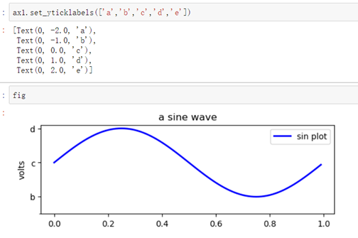
也可以通过set_yticklabels()函数来自定义tick label内容。
ax1.set_yticklabels(['a','b','c','d'])
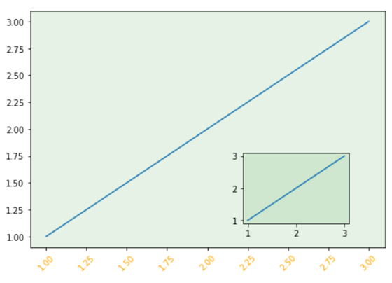
7.坐标轴练习实例
通过几个实例,来全面巩固一下坐标轴的DIY画法
##取消spine显示
for spine in ["left", "top", "right"]:
ax.spines[spine].set_visible(False)
import numpy as np
import matplotlib.pyplot as plt
import matplotlib.ticker as ticker
##
fig = plt.figure(figsize = (10,24))
fig.tight_layout()
def init(ax):
for spine in [ "top", "right"]:
ax.spines[spine].set_visible(False)
################################## ax1 ###############################
ax1 = fig.add_subplot(611)
init(ax1)
## 设定ax1尺寸 patch颜色
ax1.patch.set_color('orange')
ax1.patch.set_alpha(0.5)
## 取消y轴 tick label
## ax1.yaxis.get_ticklabels() return a list of text instance
for i in ax1.yaxis.get_ticklabels():
i.set_fontsize(0)
## 取消y轴 tick line
## ax1.yaxis.get_ticklabels() return a list of line2d instance
for i in ax1.yaxis.get_ticklines():
i.set_markersize(0)
i.set_markeredgewidth(0)
## 设定x轴 tick label 大小 字体 颜色 rotation
for i in ax1.xaxis.get_ticklabels():
i.set_fontsize(20)
i.set_fontfamily('serif')
i.set_color('orange')
i.set_rotation(45)
## 设定x轴 tick line 大小 颜色
for i in ax1.xaxis.get_ticklines():
#i.set_linewidth(3)
i.set_markersize(8)
i.set_markeredgewidth(2)
i.set_color('orange')
##设定y轴 spine的粗细 颜色
ax1.spines['left'].set_linewidth(2)
ax1.spines['left'].set_color('orange')
## 设定下x,y轴label以及数字大小
ax1.set_ylabel('ax1 ylabel',fontsize = 20,color = 'orange')
ax1.set_xlabel('ax1 xlabel',fontsize = 20,color = 'orange')
##设定y轴 spine的粗细 颜色
ax1.spines['bottom'].set_linewidth(2)
ax1.spines['bottom'].set_color('orange')
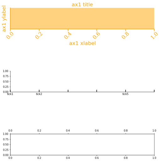
## 设定ax1标题
ax1.set_title('ax1 title',fontsize = 20,color = 'orange')
################################## ax2 ###############################
ax2 = fig.add_subplot(612)
init(ax2)
## 自定义ax2 x轴 tick label
cur_labels = [item.get_text() for item in ax2.get_xticklabels()]
new_labels = ['tick1','tick2','','','tick5']
ax2.set_xticklabels(new_labels)
#labels = [item.get_text() for item in ax.get_xticklabels()]
##rotate tick label
## 自定义x轴tick label 位置
## x轴刻度线方向朝上
ax2.tick_params('x',direction = 'in')
for i in ax2.xaxis.get_ticklines():
#i.set_linewidth(3)
i.set_markersize(8)
i.set_markeredgewidth(2)
################################## ax3 ###############################
ax3 = fig.add_subplot(613)
init(ax3)
## 为顶部x轴设定tick
ax3.spines['top'].set_visible(True)
ax3.twiny()
## 自定义x轴tick label 内容
plt.subplots_adjust(hspace =2)
8.Legend:图例
Legend介绍
在matplotlib中,Legend本质是一个composite type,也叫一个容器类,由handle和text对象组成。
通常不需要用户显示的创建一个Legend实例,而是直接通过调用ax.legend()函数返回一个legend对象,从而创建图例。
一个legend由一个或多个entry组成。
Legend = entry1+(entry2)+…
entry=key+label
key:图标
label:text描述
handle(句柄):用于产生entry的原始对象。(比如散点,曲线等;)
.legend()
Ax 或figure调用legend()函数会返回一个legend对象。
例子1:自动添加legend
一个简单的例子来说明什么是handle,什么是label:
import numpy as np
import matplotlib.pyplot as plt
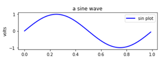
fig = plt.figure()
fig.subplots_adjust(top=0.8)
ax1 = fig.add_subplot(211)
ax1.set_ylabel('volts')
ax1.set_title('a sine wave')
t = np.arange(0.0, 1.0, 0.01)
s = np.sin(2*np.pi*t)
line, = ax1.plot(t, s, color='blue',label='sin plot', lw=2)
ax1.legend()
handles, labels = ax1.get_legend_handles_labels()
通过axes.get_legend_handles_labels()可以获取到handles对象以及labels,不难发现,在本例,handles是一个Line2D对象,labels是一个Text文本列表
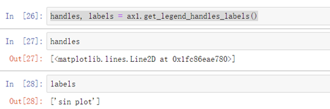
axes.get_legend_handles_labels() 该函数会返回一个handles(或者说能够转化成handles的artist对象)列表。
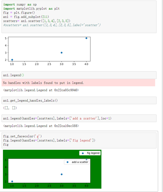
例子2:手动添加legend
import numpy as np
import matplotlib.pyplot as plt
fig = plt.figure()
ax1 = fig.add_subplot(211)
scatters= ax1.scatter([1,3,4],[2,3,5])
#scatters= ax1.scatter([1,3,4],[2,3,5],label='scatter')

ax1.legend()
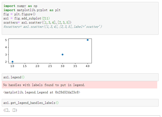
例子2可以看出,如果在创建一个散点对象(handle)时,没有指定label,那么即使调用了legend()函数,也不会把handle和label放进legend对象中。 解决方案:
- 要么在创建散点时,指定Label: scatters= ax1.scatter([1,3,4],[2,3,5],label=’scatter’)
- 要么手动添加handles 与对应的labels
一些常见的用法
##由于已经有了label,因此调用legend不需要再指定label
line_up, = plt.plot([1,2,3], label='Line 2')
line_down, = plt.plot([3,2,1], label='Line 1')
plt.legend(handles=[line_up, line_down])
##该图显示的label是'Line Up', 'Line Down'
line_up, = plt.plot([1,2,3], label='Line 2')
line_down, = plt.plot([3,2,1], label='Line 1')
plt.legend([line_up, line_down], ['Line Up', 'Line Down'])
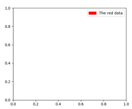
例子3:自定义legend 要注意,并不是所有artist对象都能添加到legend。 也并不是handles必须存在于axes中才能添加到legend上,可以人为添加。
import matplotlib.patches as mpatches
import matplotlib.pyplot as plt

red_patch = mpatches.Patch(color='red', label='The red data')
plt.legend(handles=[red_patch])

plt.show()
legend其他应用
Legend位置设置
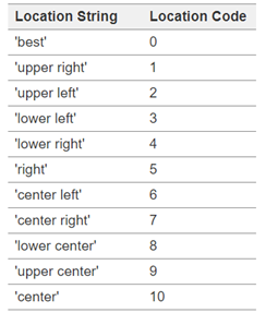
位置设置有3种方法:
1.调用legend()函数的loc参数 Axes.legend()中的参数loc可以指定位置。
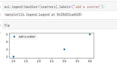
e.g ax1.legend(handles=[scatters],labels=[‘add a scatter’],loc=1)
2.调用legend()函数的bbox_to_anchor参数。(2个或4个浮点构成的tuple)
4元组:(x, y, width, height)
2元组:(x, y)
3.loc参数与bbox_to_anchor参数相结合。
##0.5,0.5表示位于ax的正中间,lower left表示处于(0.5,0.5)的点是图例的左下角的点。
ax1.legend(loc='lower left',bbox_to_anchor=(0.5, 0.5)

##0.5,0.5表示位于ax的正中间,upper left表示处于(0.5,0.5)的点是图例的左上角的点。
ax1.legend(loc='upper left',bbox_to_anchor=(0.5, 0.5)
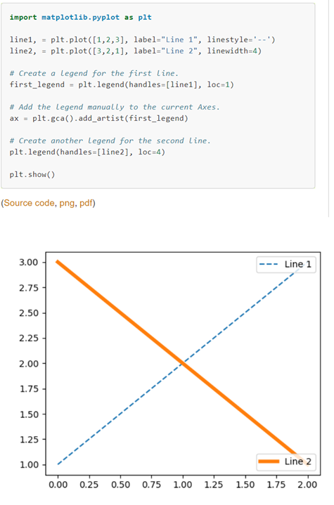
设置多个legend
如果多次调用ax.legend(),只能不断地更新,并只显示1个legend.
如果想要添加多个legend,可以参考下面的例子:
交换legend顺序
import numpy as np
import matplotlib.pyplot as plt

generate random data for plotting
x = np.linspace(0.0,100,50)

y2 = x*2
y3 = x*3
y4 = x*4
y5 = x*5
y6 = x*6
y7 = x*7

plot multiple lines
plt.plot(x,y2,label='y=2x')
plt.plot(x,y3,label='y=3x')
plt.plot(x,y4,label='y=4x')
plt.plot(x,y5,label='y=5x')
plt.plot(x,y6,label='y=6x')
plt.plot(x,y7,label='y=7x')

get current handles and labels
this must be done AFTER plotting
current_handles, current_labels = plt.gca().get_legend_handles_labels()

sort or reorder the labels and handles
reversed_handles = list(reversed(current_handles))
reversed_labels = list(reversed(current_labels))
call plt.legend() with the new values
plt.legend(reversed_handles,reversed_labels)
plt.show()
2.3 script层常用的函数
本质上,我们看到的plt.*()的形式,都是matplotlib的脚本层进行封装后的函数。
plt.axis('equal')
##取消坐标轴
plt.axis('off')

plt.xlabel('test')
plt.ylabel('')
脚本层提供了类似于MATLAB的编程语法,可以很轻松地画出想要的图形。由于实在太过简单,这里不详细介绍。
补充:jupyter的魔法函数
利用jupyter notebook非常方便,下面是一些常用的魔法函数。
%matplotlib inline
优点:将inline作为后端传递,可强制在浏览器中呈现图形。 局限:是无法在render后修改图形。(换句话说,一旦图片绘制完毕,无法进一步添加标题等零件。)
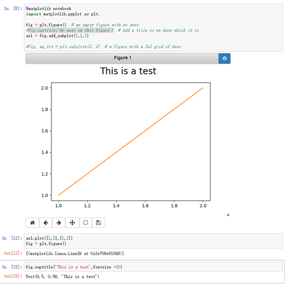
%matplotlib notebook
notebook后端能够克服创建图片后无法修改的问题。在notebook后端到位的情况下,如果调用了plt函数,它会检查是否存在激活的figure对象,如果有,调用的任何函数都将作用于该figure对象。 如果激活的figure对象不存在,它会创建一个新figure对象。
例子:
上一篇: 浅谈卷积神经网络中的卷积运算的统计学/生物学意义
下一篇: 详解DADA2算法原理